

OVERVIEW
Study Together is a digital space where students can connect, collaborate, and support each other in their learning journey, anytime and anywhere.
The goal was to create a responsive web app to help students build meaningful study networks, exchange resources, and provide mutual support.
ROLE
UX/UI Designer
User research, interaction design, prototyping and testing.


“I love the idea of having the right support at the right time for my course, such as study materials and advice."
PERSONA
Our story begins with Alex, a dedicated online student who's looking for fellow learners to practice with and share resources. Alex isn't just another persona – he became our compass throughout the design process, helping us understand the real needs and challenges of remote learners.
User Stories
01
As a new user, I want to create a profile, so that other students can find me.
02
As a frequent user, I want to be able to message other students, so that we can problem-solve together.
03
As a frequent user, I want to be able to write posts for other students to read, and view and share resources, such as articles and videos, so that we can share knowledge.
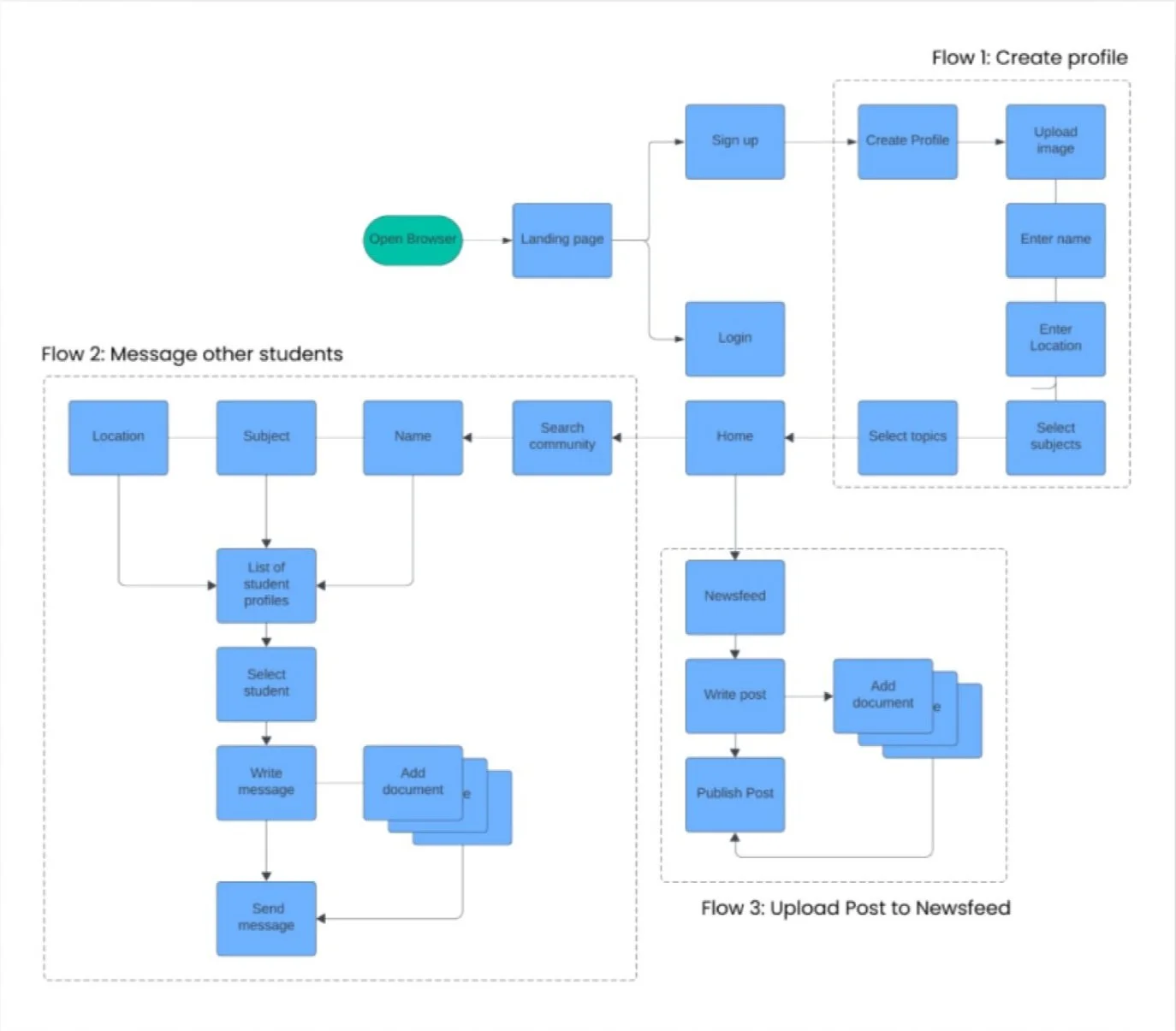
User Flows
Walking in Alex's shoes, I started mapping out his journey on paper. What steps would he take to find study partners? How would he share resources? These initial sketches evolved into a comprehensive user flow diagram that became the backbone of our app's structure.

Low-Fidelity Wireframes
With the foundation in place, I dove into the creative process of sketching screen layouts. These rough ideas transformed into low-fidelity wireframes, which I then brought to life as an interactive paper prototype using Marvel. This early prototype helped us test if we were on the right track with our basic functionality.
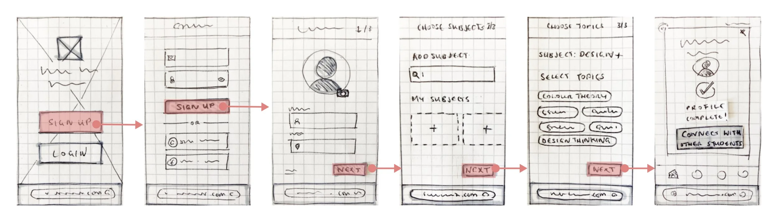
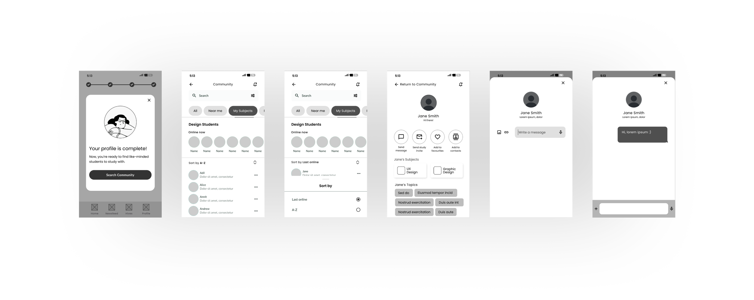
Mid-Fidelity Wireframes
Flow 1: Create Profile

Flow 2: Send Message
Flow 3: Upload Post to Newsfeed

Refining the Designs
As the design took shape, I focused on making every interaction feel natural and intuitive. Take password creation, for example – we've all experienced the frustration of complex password requirements. To solve this, I implemented a friendly strength meter that guides users visually, along with simple toggles for password visibility and clear, helpful hints. It's these small details that make a big difference in the user experience.
PROBLEM
Data input should be tailored to specific contexts of use to save the user time, reduce error and minimise friction.
SOLUTION
Auto-complete suggestions save time by completing the location entry that user is typing.
Input labels are always visible so users know exactly what input type is required.
Inline validation confirms acceptance of input or errors with guidance on how to fix the error.

PROBLEM
Users' passwords should be sufficiently secure without the experience of creating a strong password causing friction.
SOLUTION
A horizontal strength meter shows how secure the password is and motivates the users to input stronger entries.
Users can toggle the password visibility by tapping the visibility icon in the input field.
Password requirements are visible in help text.

Visual Direction
The visual identity of Study Together was inspired by three powerful keywords: Discuss, Inspire, and Support. I carefully selected colors, shapes, and illustrations that would create a calm, encouraging environment – perfect for focused studying and collaborative learning.

Shape
I looked at the way abstract shapes might be used to convey ideas of community and discussion.
Imagery
When choosing illustrations, I picked out examples that could evoke the image of a friendly, relatable learning community.
Typography
I later decided on a Lato/Vollkorn pairing over Gothic or Grotesque fronts to achieve more contrast between headings and body.
Colour
To to accompany the brand green specified in the project brief, I picked out warm terracotta colours intending to reinforce the sense of community that Study Together offers.


DESIGNING FOR DIFFERENT BREAKPOINTS
Taking a mobile-first approach was crucial for this project. Rather than trying to squeeze a desktop site into a phone screen, we started small and thoughtfully expanded the design for larger devices adding more as I scaled up.

High-Fidelity Designs


Final Prototype
Key Learnings
01
Late in the process, I realized that our subject category carousel wasn't as user-friendly as it could be, leading to a switch to a tab design. This taught me the valuable lesson of incorporating more user preference testing earlier in the process.
02
Initially, I fell into the common trap of trying to fill larger screens with extra content – more is better, right? Wrong. I discovered that maintaining a clean, consistent single-column layout across all devices created a more cohesive experience. Sometimes, simplicity truly is the ultimate sophistication.
03
While the animated elements added some delightful touches to the interface, I learned that balancing the 'wow factor' with functional refinements is key. In retrospect, spending more time perfecting core components like list items would have enhanced the overall user experience even more