
Prepared
A tailored app experience designed to be a trusted companion on the PrEP journey
Role: UX/UI Design
〰️
Client: CareerFoundry
〰️
Tools: Figma, Marvel
〰️
Role: UX/UI Design 〰️ Client: CareerFoundry 〰️ Tools: Figma, Marvel 〰️
The Challenge
The project began with a simple question - how could managing PrEP medication be made easier and more empowering for those relying on it?
As I sat down with friends who take PrEP, their stories of missed doses, forgotten refills, and nagging anxiety painted a clear picture. They needed a tool to cover all the bases, freeing them to focus on their health and lives.
Understanding the Competition
Before diving into the Prepared app itself, I needed to get the lay of the land. What were PrEP users already using to manage their meds? And where did those existing solutions fall short?
Preptime is tailored for the PrEP user's needs, with specialized reminders and refill tracking. Its interface also feels streamlined to PrEP taker’s needs, focusing on the the essentials, a calender and Timeline.


MyTherapy, lacked the nuanced understanding of PrEP that PrEPtime had instead providing a one-size-fits-all solution

As I dove into the leading competitor apps, a few key differences emerged that would inform the Prepared experience:
Generalist vs. Specialist
While MyTherapy offered a sleek, streamlined medication tracking interface, it lacked the nuanced understanding of PrEP needs. Its tone and features were geared more towards chronic disease management, rather than sexual health.
In contrast, the PrEP-specific app PrEPTime had the specialized knowledge, with reminders and calendars tailored for daily and on-demand PrEP use. However, it fell short on essential features like pill counts and refill prompts.
Usability Challenges
Both apps struggled with clunky calendar interfaces that were difficult for users to edit and customize. The visuals also felt dated, lacking the modern, intuitive aesthetic that PrEP users likely craved.
User Interviews
With the competitive landscape mapped out, it was time to dive deeper - by going straight to the source. I sat down with three individuals who fit the Prepared target demographic, ready to hear their stories and pain points first-hand.
What tasks did they want a PrEP app to help with? How did they currently manage their medication and health data? Where did existing apps fall short in supporting their needs?


“It would be useful to have reminders about the prescription coming to an end.”
— Ian
“It feels like an achievement, seeing the week full of ticks”
— Jon
“Information about missed doses and what to do would be really helpful.”
— Robin
Uncovering Insights
With the competitor analysis complete, it was time to dive deeper into the real user experiences. I combed through the interview data, organizing the key facts, quotes, frustrations, and needs into thematic categories. This affinity mapping process allowed patterns and insights to emerge - the kind that would be essential for crafting a truly user-centered design.

Key Insights
*
Key Insights *
PrEP Resources
Users are unsure what to do if they miss a dose and want to be able to access specific, reliable advice on this subject.
PrEP Adherance
When users deviate from their regular daily routine they are more likely to miss a dose.
Notifications
Users are more likely to pay attention to notifications when they are specific to PrEP and are distinct from other phone notifications.
Health Tracking
Users like viewing their health data visualised on a calendar. This aids their memory, helps them maintain consistency, and gives them a sense of achievement.
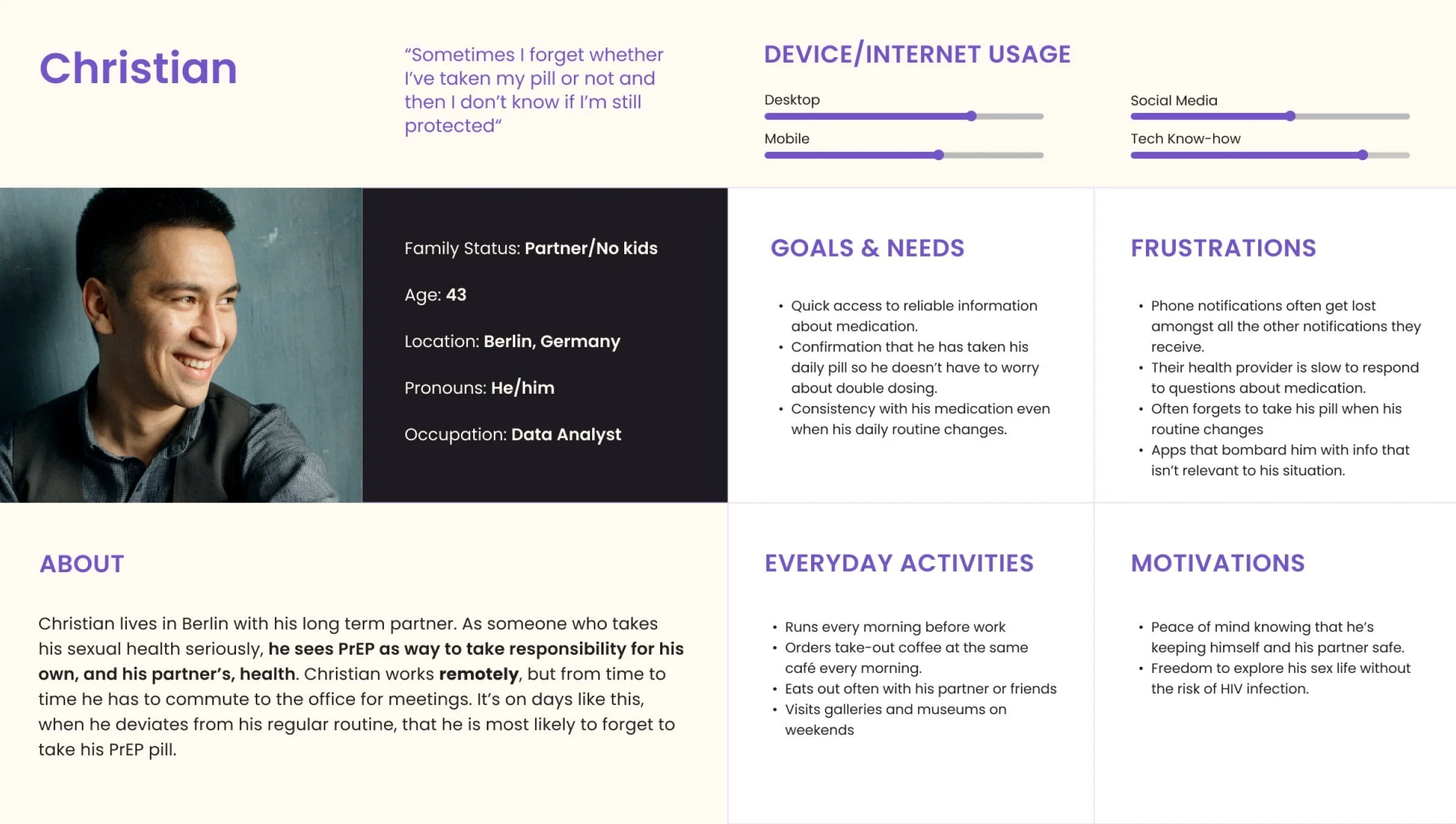
Personas
I brought the user research insights to life by creating two design personas - Christian and David.
“I find it difficult to take my pill at the same time every day when my daily routine is so changeable.”

“Sometimes I forget whether I’ve taken my pill or not and then I don’t know if I’m protected.”
User Journey Maps
As I stepped into David and Christian’s shoes, I could better empathize with the emotional ups and downs of the PrEP journey. Where did they get stuck? What small moments of success powered them forward? These empathetic journey maps helped me see the app through their eyes.


“It's a relief to know that I'll know to book my appointment in time so I won't get caught short on my last few pills.”
David
“Sometimes if I'm busy I ignore the reminder and then it gets buried in amongst all my work notifications.”
Christian
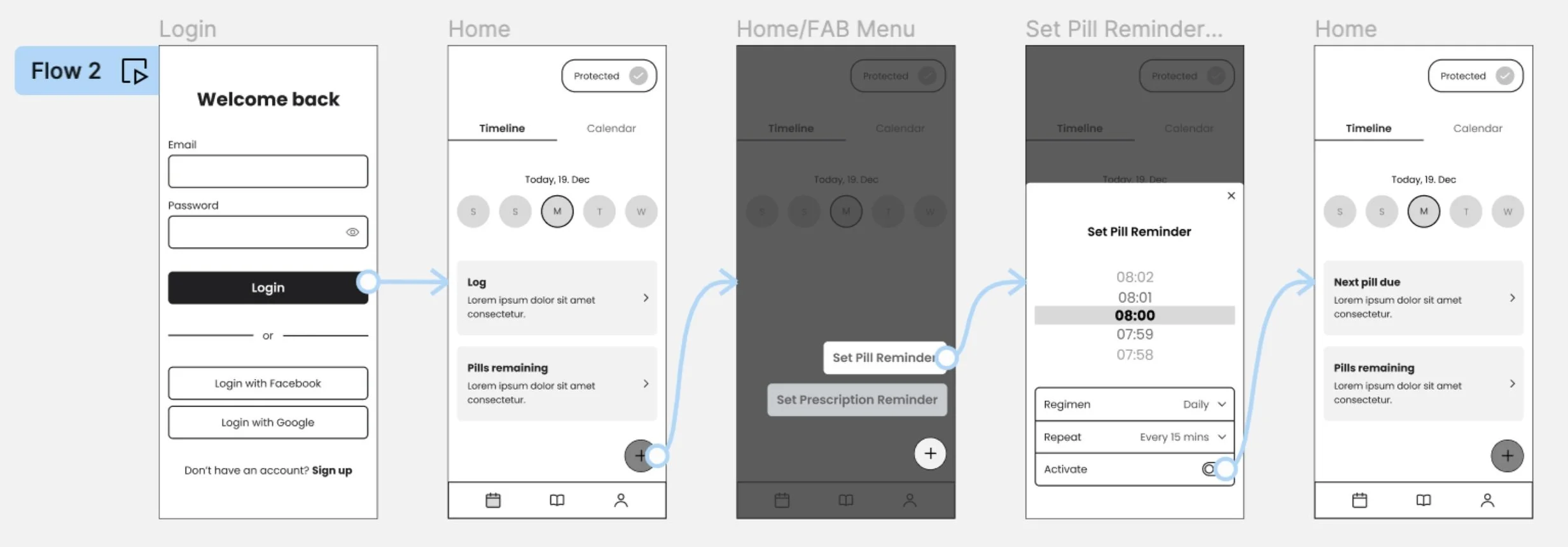
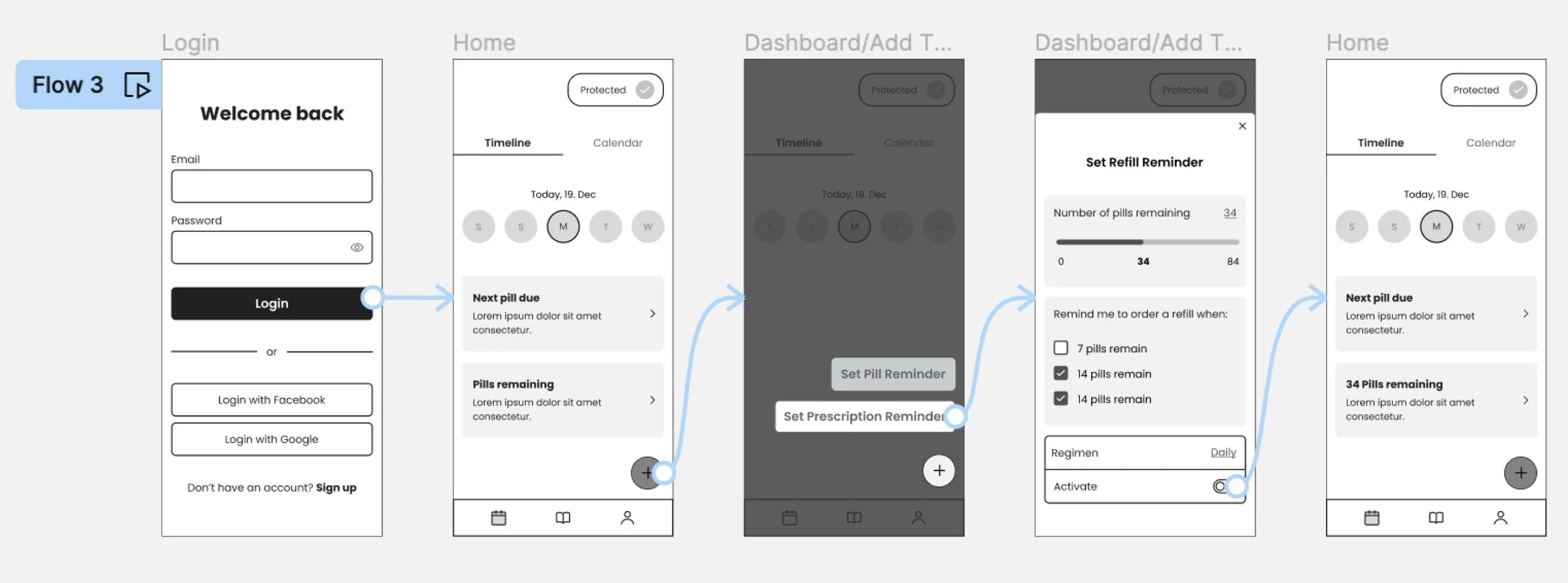
User Flows
Before jumping into the app architecture design, I needed to understand which screens Christian and David would interact with to achieve key tasks. I mapped out two key user flows, referring to their user journey maps.


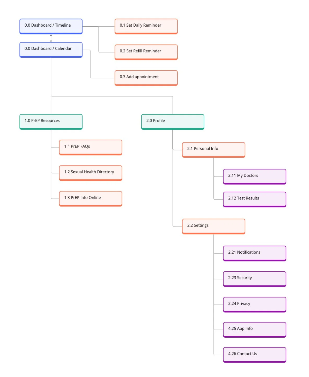
Information Architecture
With the the exact flows and interactions that would power Christian and David's daily experiences mapped out, I was ready to translate those persona experiences into a cohesive information architecture.

I sketched out initial sitemaps, then tested them with online card sorting to validate my proposed hierarchy. Each round of feedback helped me refine the structure, ensuring the essential tasks and features were front and centre.

Card Sort Results
Sitemap Improvements
Armed with the card sorting insights, I got to work streamlining the sitemap. I swapped the vague "Overview" for a more intuitive "Calendar" label, making it the hub for time-based actions. I consolidated personal and medication info under a single "My PrEP" category. And I renamed "Resources" to "PrEP Resources" to clearly distinguish it as the source for general medication guidance, not personal health data.
To ensure a more seamless experience, I also added smart connections between key features. Now, users could easily add appointments directly from the Calendar or My PrEP sections.
Card Sort Insights
With the initial sitemap in place, it was time to put it to the test. I recruited a group of representative users to participate in an online card sorting exercise. As they grouped and labeled the app's core features, some interesting patterns emerged.
First, the broad "Overview" category seemed to be a bit of a catch-all - participants often used it to dump things like "Contact Us" that didn't fit neatly elsewhere. Clearly, I needed to get more specific with my top-level navigation.
Another sticking point was how to organize personal profile info versus medication management. Users were divided on whether to group those under "My PrEP" or keep them separate. Seemed like more distinct categories were the way to go.
The "Resources" label caused some confusion - users weren't always sure if that was for their own information or general PrEP education.
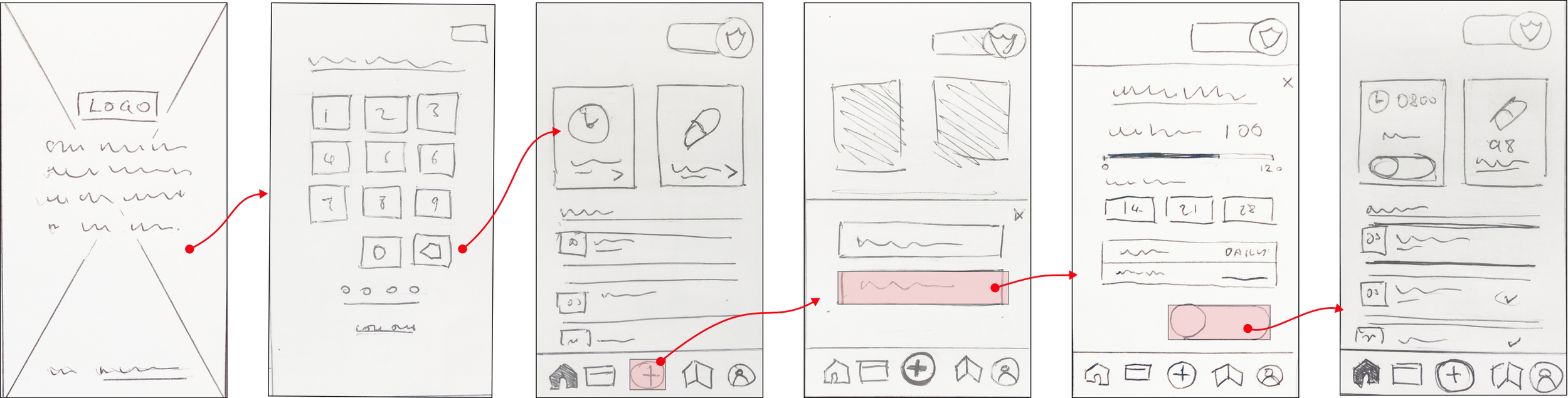
Low Fidelity Wireframes
By sketching paper wireframes I could rapidly explore multiple screen iterations and focus on designing the basic app functionality.


Mid-Fidelity Prototype
With the basic functionality fleshed out in my paper wireframes, I wanted to create more detailed, clickable prototypes in Figma, ready to test basic interactivity with real users.
User Testing
6 Participants
Online/In-person
15 Minutes
Test Goals
To determine if participants readily understand what the app is for (i.e., an application for managing PrEP) and the value it provides.
To determine how quickly and easily participants sign up, and whether there’s any hesitation to provide personal information.
Observe how easily users locate the reminder setting functions and can set reminders.
At this stage, I conducted usability tests to observe and assess the ease with which users were able to locate and achieve basic functions of the app.
Analysing Test Results
Rainbow Spreadsheet
To help me prioritise which issues and improvements should be prioritised, I used a Rainbow Spreadsheet to highlight core observations and classify errors according to severity.

Affinity Mapping
By creating an affinity map, I was able to group data under top level categories, most importantly identifying any trends concerning errors.
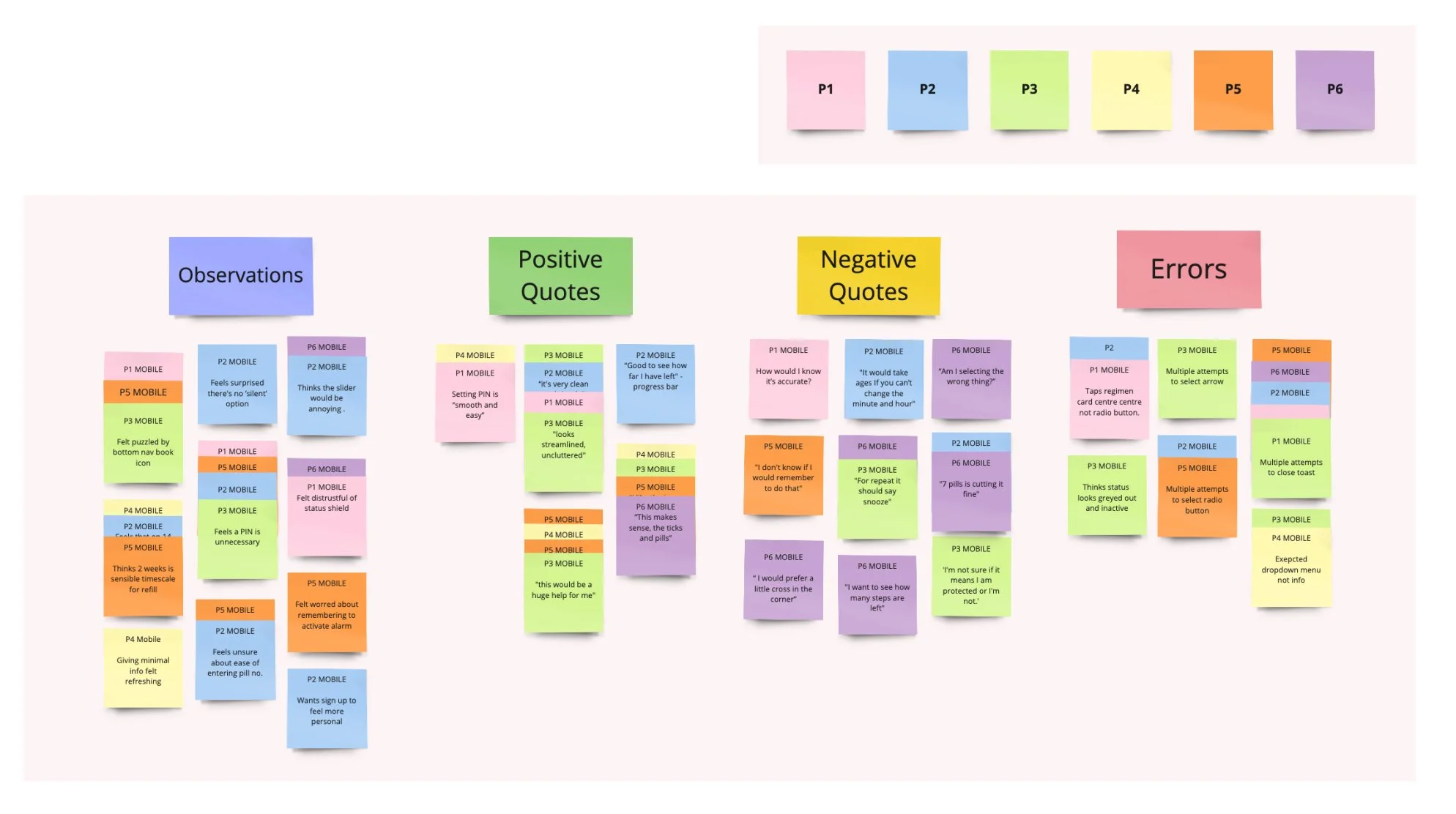
Usability Test: Identified Issues
Issue 1: 33 % of participants made multiple failed attempts to tap the radio button.
Improvements:
Expand the tap target to the entire card and increase the card size to give a larger selectable area.
Remove the expanding text, and replace with concise regimen descriptions.
Improved cards

Original cards
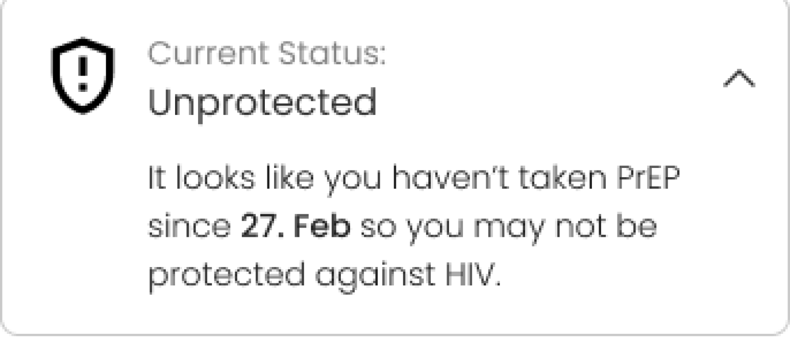
Issue 3: 33% of participants said that they found the ‘Not protected’ status alarming.
Improvements:
The cross icon was replaced with a less aggressive exclamation mark and dropdown text that qualifies the status with user-specific details (e.g. time at which the last pill was taken) has been included.
Original shield

Improved shield
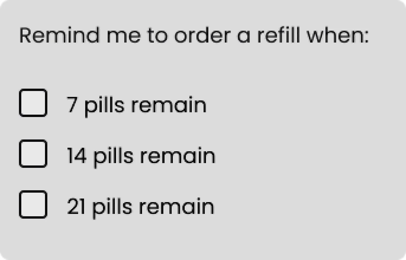
Issue 2: 50% of participants said that they needed at least 2 weeks to order a refill
Improvements:
Participants said that they a 7 days wouldn’t give them sufficient notice to order a prescription refill so I removed this option from the refill reminder menu, including instead 14, 21, and 28 pills remaining options.
Original shield
Improved shield

UI Design
With the errors flagged during user testing now ironed out and the basic flow and functionality validated, I was ready to design the app’s finer details and UI.

Hi-Fidelity Designs
I continued to refine my designs to improve usability, and particularly to ensure that the app met WCAG accessibility standards.
Original screen

Improved screen

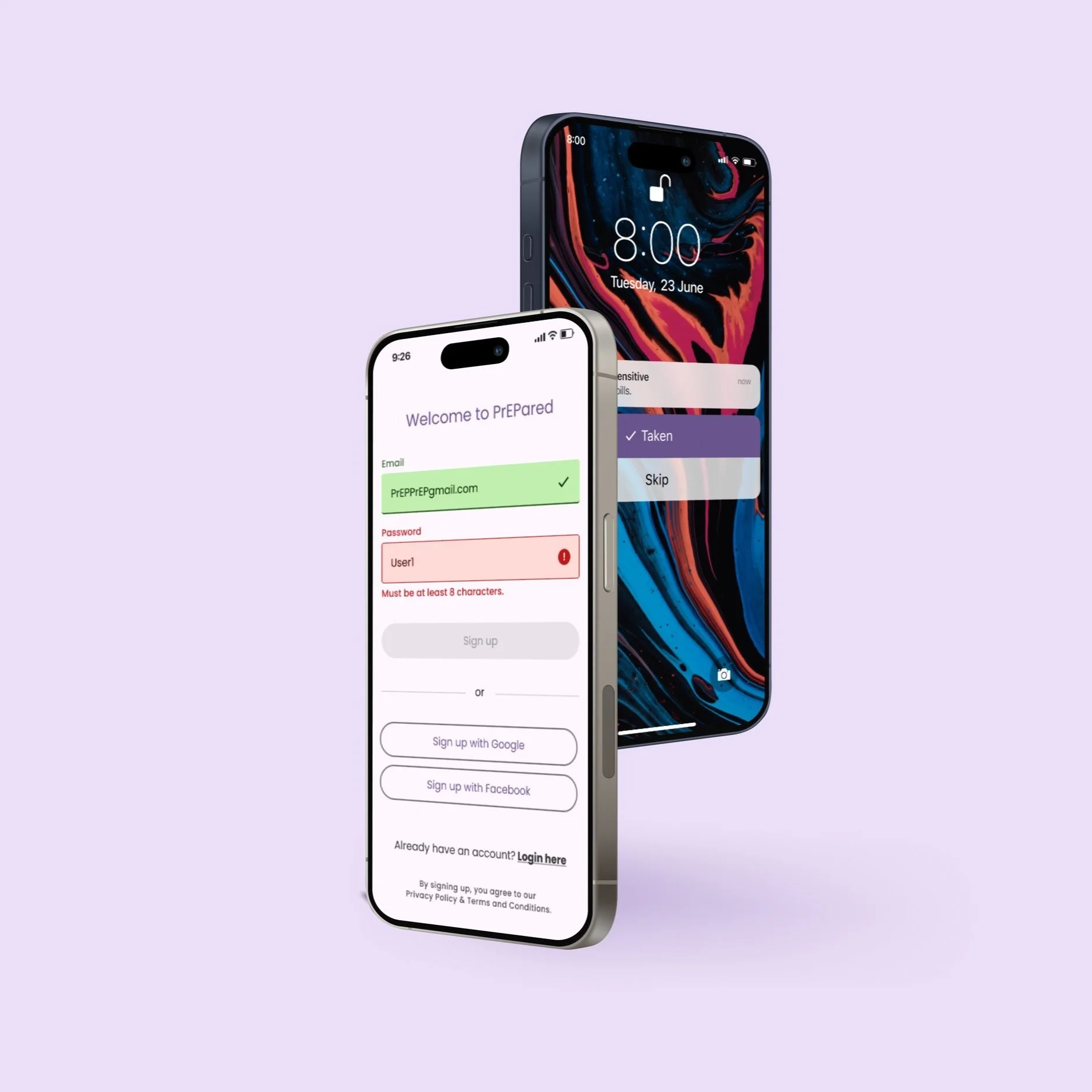
Placeholder example text added
Conforming to WCAG guidelines, the example text provides guidance on how to complete the form.

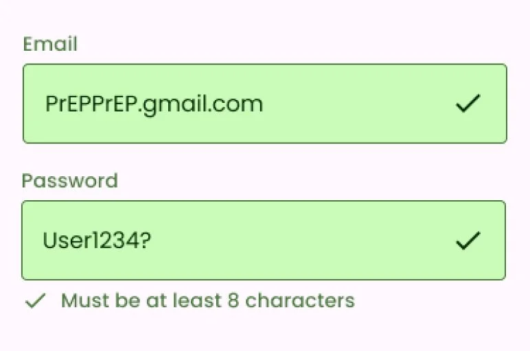
Icons added to indicate input success
Icons support the colour fill and stroke, providing additional feedback for people with colour blindness.
Original screen

Improved screen

Image padding
The padding and curved corners give the screen a softer, more playful feel that’s consistent with the rounded buttons.
Colour fill applied only to the current step
To reduce confusion about which step the user is on, only the current dot has a colour fill in the newer version.
Original screen

Improved screen

Larger input field replaces slider
The numerical input field exceeds the 48 dp WCAG AAA touch target reccomendations.
Field states added
The umerical input field now has distinct state styles indicating focused and non-focused states.
After the accessibility improvements implemented to ensure that the designs meet accessibility WCAG standards and the needs of the target users, the final high-fidelity design was now complete.


Key Learnings
01
Insghts gathered through user interviews regarding specific concerns over obtaining PrEP prescriptions helped to shaped the direction of the project and taught me the value of speaking with real users to determine the value and goals of product.
02
I learned that one of the most important ways that the app could give user’s confidence regarding their medication regime and protection status was by ensuring that the copy is simple, direct and informative (e.g. on the status shield).
03
It would have benefited this project to explore the alarm push notification designs further and perform preference testing to validate hypotheses about the content and designs.