Verba
A mobile app that helps foreign language learners memorize new vocabulary.

The Problem
People learning a new language need a way to methodically categorize, reference, and study new vocabulary and concepts so they can make progress with their foreign language learning.
Tools: Balsamiq, Figma
Role: UX Designer
User Interviews
I conducted interviews with 3 people aged between 35-45 who were currently studying an additional language. I aimed to discover more about their motivations for learning a new language, which tools they had used to support their studies, and any barriers they had encountered.
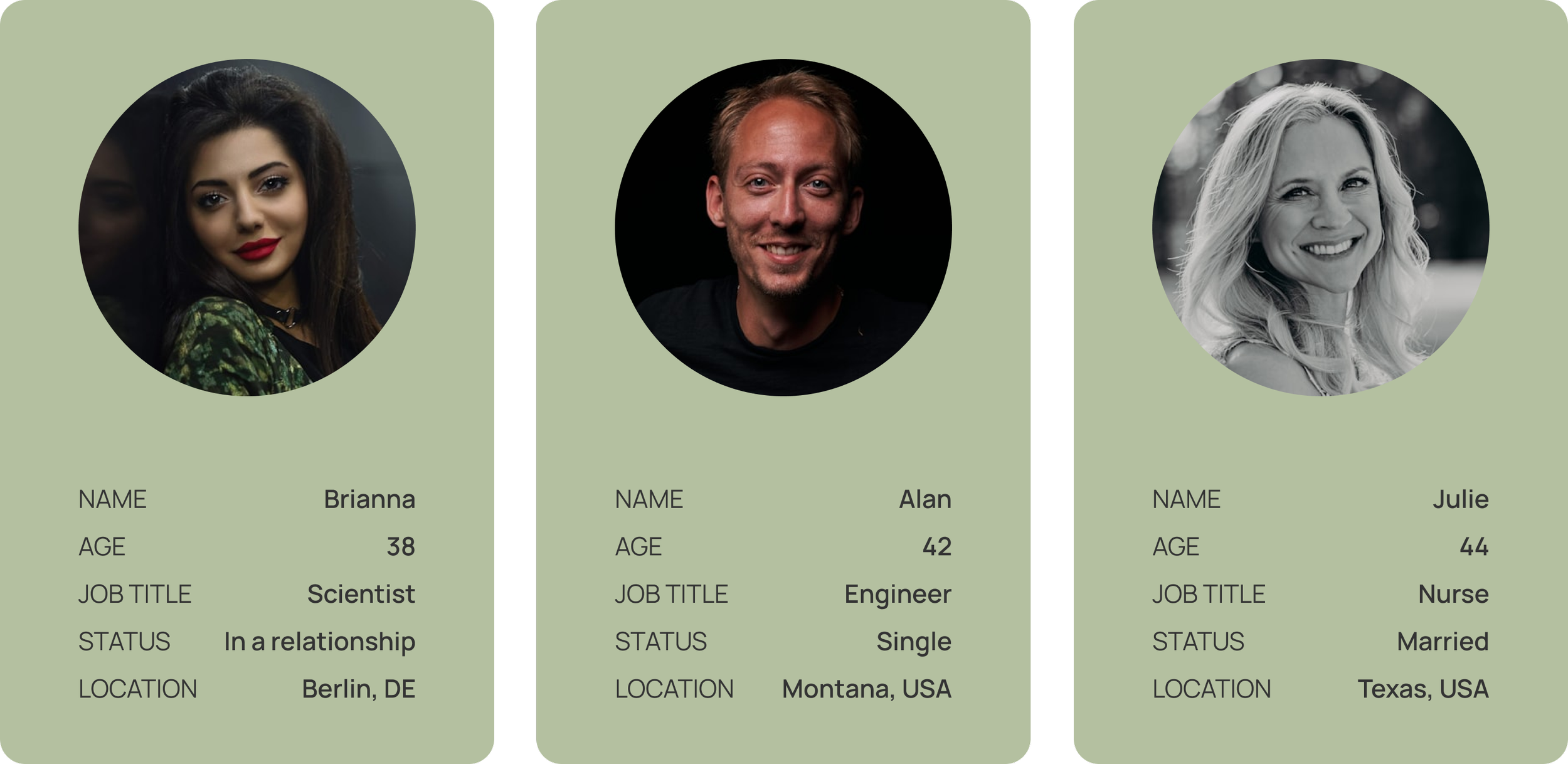
“I always feel the need to achieve something to feel motivated.”
— Brianna
“It’s hard to commit 30 mins in advance but I can do 5 mins at a time”.”
— Alan
Interview Insights

Common Themes
Interviewees said that visual input supports their learning, especially when combined with other types of input. Repetition is also important when it comes to retaining new vocabulary.
Challenges
The biggest struggle for interviewees is commitment, people don't have time to build consistent learning habits, or they get distracted. They usually learn when they have short intervals between other activities.


Opportunities
Potential opportunities for improvement could be found in incorporating spaced repetition methods and ways for users to add imagery/ sentences to provide context to new vocabulary.
Proto Persona
Meet Maria! She emerged from the stories and experiences shared during my user interviews. By bringing her to life as a proto persona, I could step into her shoes and understand what makes her tick. What gets in the way of her learning goals? What would make her learning easier? These questions guided my design process at every step.

“Committing extra time for learning around kids and work is challenging so I need something flexible that I can do whenever I have a free minute”
Maria
Information Architecture

Having established Maria's profile, I mapped out her journey through two key scenarios, visualizing each interaction point along the way.
Through these user flows, I:
Mapped Maria's path from "I need to..." to "Done!"
Got a bird's-eye view of how she'd move through the app
Found opportunities to smooth out any bumps in her journey
User Flow 1: Add Vocabulary
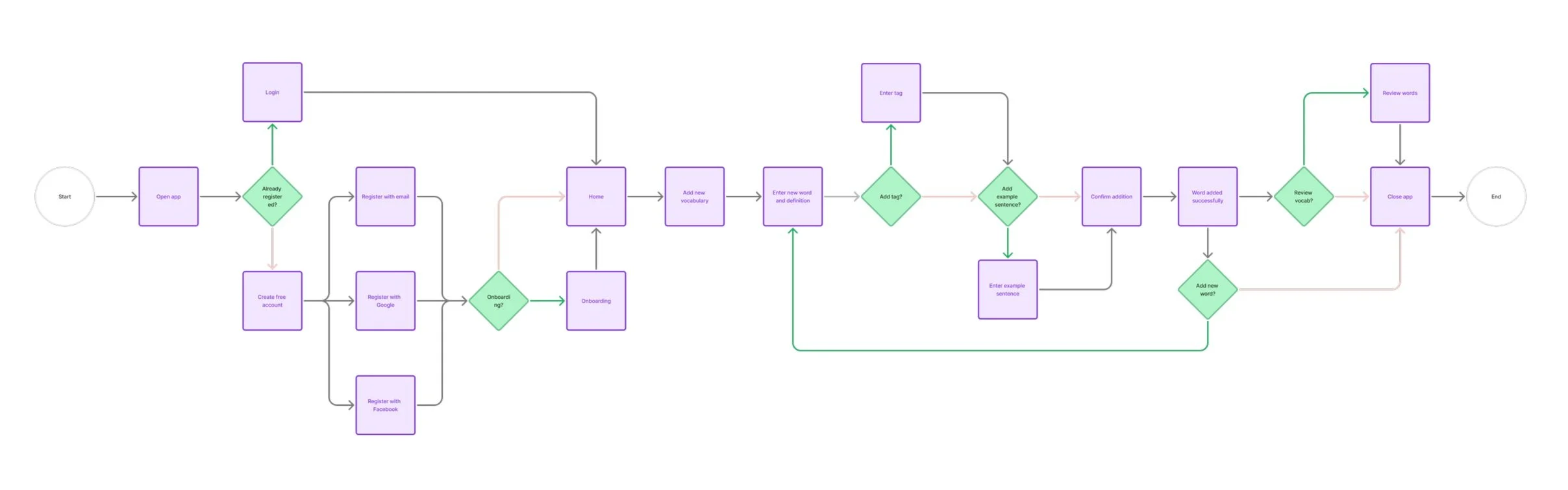
User Flow 1: Add Vocabulary

Site Map

The site map translates insights about vocabulary learners' needs into a clear structural blueprint. It organizes key aspects language reviews, progress tracking, and custom word lists into an intuitive hierarchy before designing individual screens.
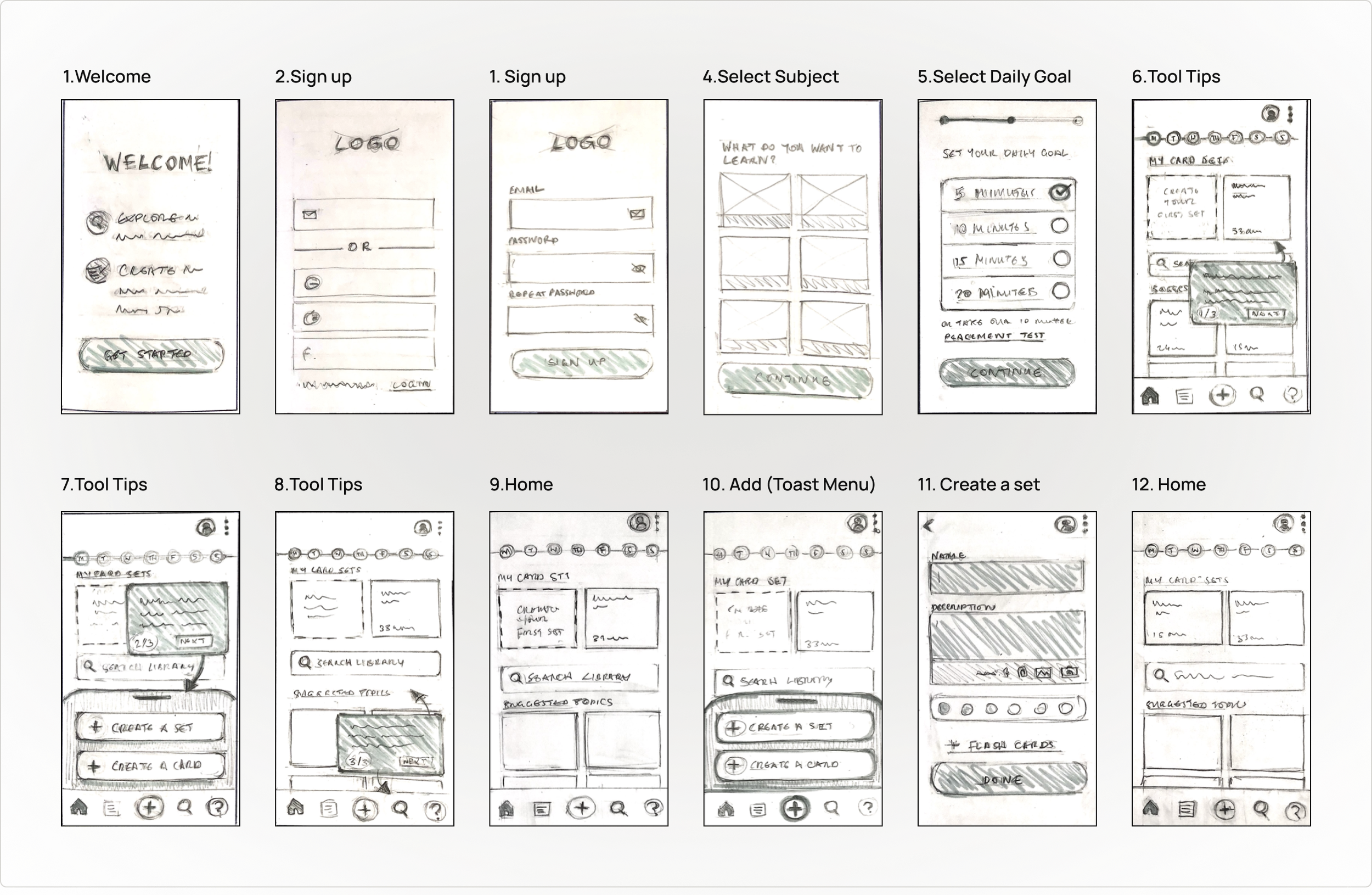
Low-Fidelity Wireframes
From flowcharts to screens - this was where Maria's journey started taking shape. I began sketching low-fidelity wireframes, focusing on the basic building blocks of each screen. Think of it as drawing the blueprint of a house before picking out the furniture and paint colours. This approach let me focus on what really matters: creating intuitive paths through the app.
User Flow 1: Create a Flashcard

User Flow 2: Create a Flashcard Set
User Testing

Overview
These initial sketches evolved into a clickable prototype using Marvel. Now it was time for the exciting part - watching real users interact with these early designs!
Goal
I invited users to test-drive the prototype, asking them to complete key tasks that would be part of their daily journey:
Creating their first set of flashcards from scratch
Building their vocabulary collection
Enriching their flashcards with images and audio
Taking their flashcards for a practice spin
This hands-on user testing helped me spot where our 'blueprint' needed adjusting to better serve real learners' needs.
Key Insights
01
All participants were able to complete the tasks, and found the interface generally intuitive to use.
02
Users were able to open a set and review the flashcards quickly. They found the swipe gestures to be intuitive to use but didn’t immediately understand what action was described by the ‘Learn’ button.
03
Users were not confident they had saved their card after tapping the ‘Save card’/’Save set’ buttons and weren’t able to distinguish the new sets on the home screen.
Improvements
In response to the issues identified during usability tests, I made several improvements to my designs including modifying button labels to clarify actions, and providing a clearer exit from tool tips.
Create a Flashcard
Issue:
Users were confused about whether they were creating a set or new card.

Improvements
1. Button labels changed to indicate the actions to be performed more clearly.
2. A confirmation message now communicates the action that ha been performed confirming that a new card has been saved.
Tool Tips
Issue:
Participants were unsure how to exit onboarding tutorials to access the home screen features.

Improvements
‘x’ added to the corner of each box, providing a visible exit.
Tutorial boxes now more prominent with the rest of the screen obscured and focus point highlighted.
Home Screen
Issue:
Participants mistook tiles under My Card Sets for individual flashcards.

Improvements
Arrow added to make ‘My Sets’ label is more identifiable as a link to the ‘My Sets’ screen. The example set tiles have been removed to avoid confusion.
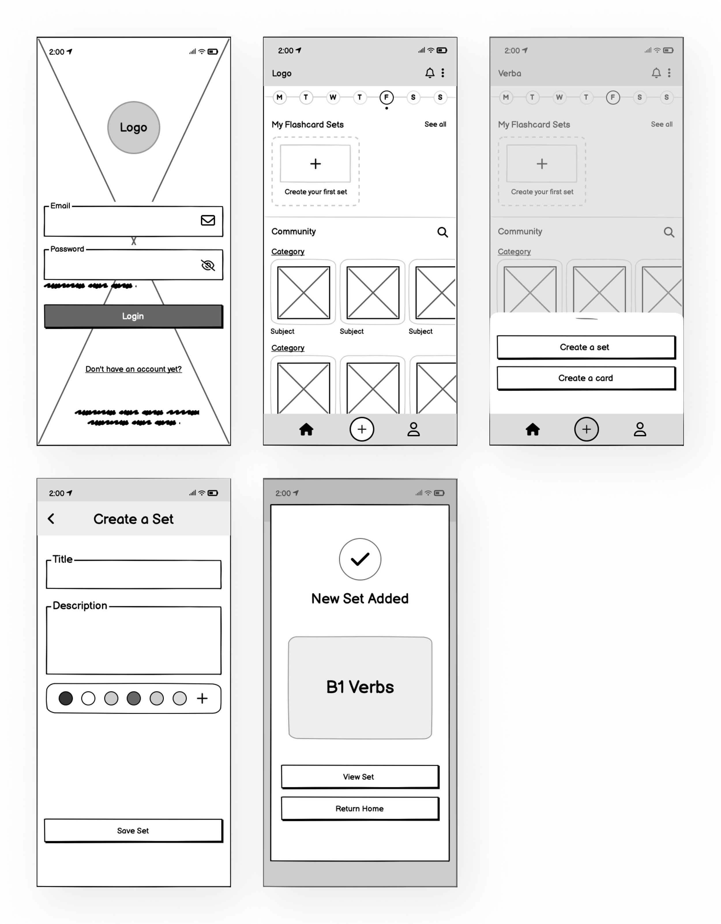
Redesigned Wireframes
Using Balsamiq, I incorporated the improvements made in response to the usability test results into more detailed digital wireframes.


Key Learnings
01
As my first UX project with Career Foundry,this was also my introduction to the iterative problem-solving process. It taught me the value of rapid sketching and testing in the early stages of the project to tweak and revise solutions in response to user’s needs.
02
In future ensuring that key actions in a low-fi prototype are clearly labelled and legible would yield more conclusive results, as there would be less uncertainty about whether responses are due to the quality of the prototype or app usability.
03
From user reactions during usability tests, I learned that the early Verba prototype didn’t adequately acknowledge and communicate when an action had been completed, leaving users feeling confused and frustrated.